Design Your First Responsive Blog HTML Template [Step-by-Step]
Howdy, visitors! I know, having a responsive design of your blog how much important. If you be interested to make it yourself, this tutorial will help you to design your first responsive Blog HTML template STEP-BY-STEP.
Before starting this tutorial, you must know about HTML , CSS and knowing JavaScript , JQuery , PSD Design is helpful but not required.
If you don’t know how to play with HTML & CSS, please start learning from W3Schools . You can also learn from anywhere.

I hope you have the basic knowledge of HTML & CSS.
In this tutorial, we will learn only about Static Blog HTML Template . If you succeed to design it, next you can jump to build Dynamic HTML Blog Theme base on Content Mangement System (WordPress, Blogger, Drupal, Magento, Shopify, Ghost etc.).
Let’s start designing Blog Template!
First, open your Text Editor from your Computer. You can also use Notepad++, Sublime Text Editor, Geany, Bracket, Atom, Visual Studio Code etc.
If you can design in Photoshop, Gimp or any Photo Editing Software, it would be better to design of your Blog in PSD file.
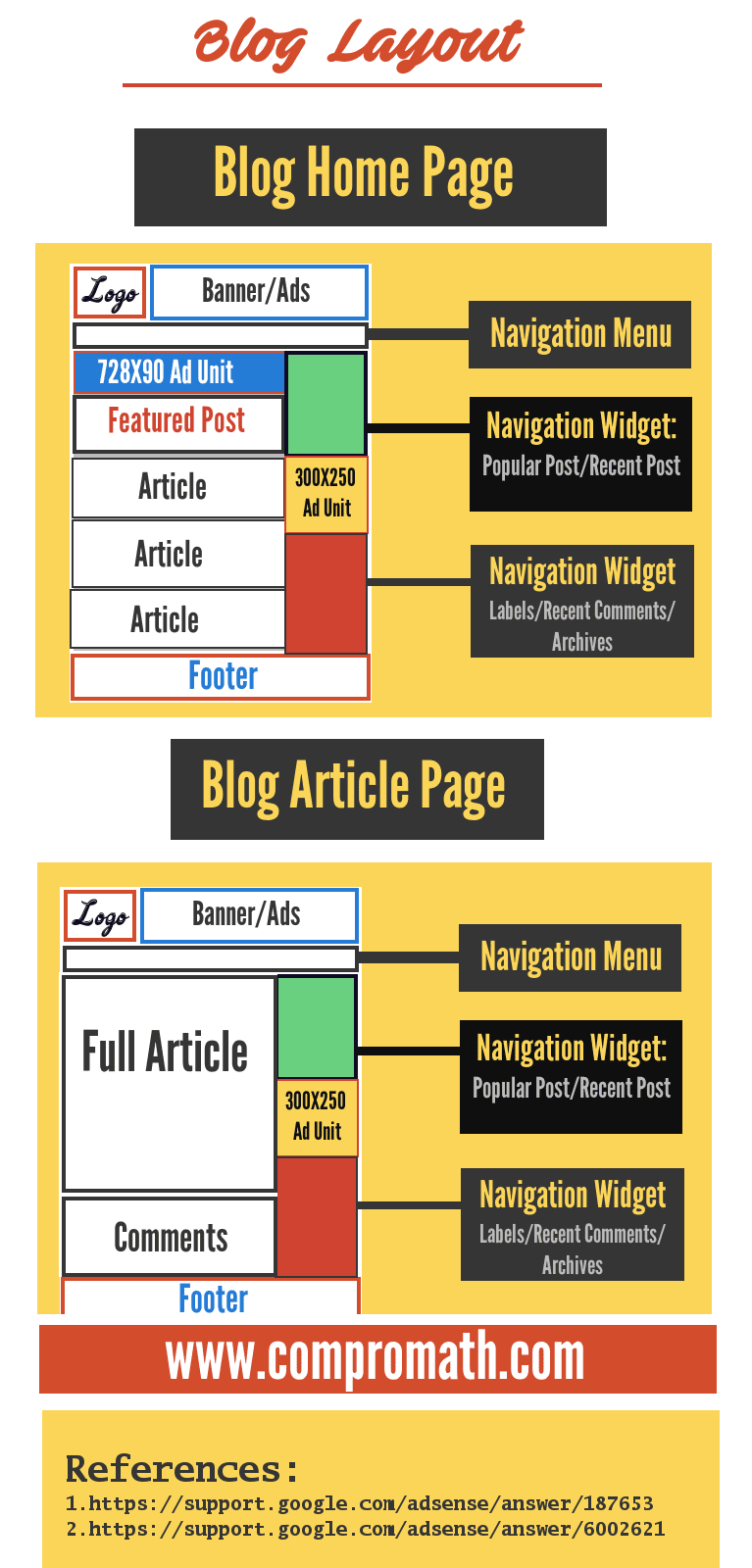
Now, we have to determine the layout of Blog, we want to make our Blog template to look at. Generally, a blog template has two type page:
- Blog Home Page – Where all posts (with jump break) are available.
- Blog Article/Post Page – Where we see the full article or post.
So if we have to design three several HTML templates, though both of all have some similar layouts: Header, Header Navigation Menu Bar, Post Wrapper, Footer.
The Basic Layout of Blog
1. Header Layout: In header layout, you can put header menu, the logo of your blog, search section, social menu, banner ads (728X90).
2. Header Navigation Menu Bar: It should be placed just after the Header Layout. You can make it fixed top menu after scroll . Your navigation menu bar must be user-friendly. It is highly recommended by Google if you want to display AdSense Ads.
3. Post Wrapper: It is the layout of displaying post or article. In Homepage of Blog, it shows several posts with jump break, but in Article Page, it shows only a post with full length. If you want to display any Ads, you can do it here.
4. Sidebar: A blog can have one or two sidebars even no sidebar. In sidebar layout, you can put several widgets: Recent Posts, Popular Posts, Ads, Search Bar, Tags, Archives etc. The ratio of the width of Post Wrapper & Sidebar should be 7:3.
5. Footer: Footer is the layout at the bottom of the blog. You can divide it into several sections. Footer can contain widgets like Sidebar Layout. You will have been seeing many of blogs don’t have a larget footer.

Layout Idea of Blog Template
If you want to choose the different layout of your blog, you can get this idea from anywhere. I have found some awesome blog layout idea on Pinterest .
Designing Blog Home Page
A blog home page should have the following layouts:
- Header
- Navigation Menu Bar
- Post Wrapper
- Sidebar
- Footer
Download Sample Blog Home Page HTML Template
Designing Blog Article Page
A blog article page should have the similar layouts of the home page. But at the end of the post, You can integrate ‘Similar Posts’, ‘Author Box’, ‘Ads’, ‘Comments Section’ etc.
Download Sample Blog Article Page HTML Template .
Responsive HTML Template
To make supportable your HTML template for all devices (Laptop, Tab, Smartphone etc), you must build responsive template. Without this reason, you should emphasize on RWD(Responsive Web Design) because it is highly recommended by Search Engine to rank up your Blog.
Read, Why RWD is important for SEO . – Search Engine Journal.
You can make responsive Blog HTML template with using CSS Framework easily. Not only for RWD, CSS Framework will help you to build your HTML template very fast and professional.
Some most popular CSS Frameworks are Bootstrap, Foundation, W3CSS, Cascade etc.
If you don’t want to make your Blog responsive without using CSS Framework for some reasons (Slow loading one of the reason), you can do it with using media query in your CSS.
We have already used this process (You will see this in downloaded HTML File).
Use the following Media Query within your CSS Code to make responsive Design.
@media (min-width: 1281px) {

  /*CSS For this device*/

}
@media (min-width: 1025px) and (max-width: 1280px) {

  /*CSS For this device*/

}
@media (min-width: 768px) and (max-width: 1024px) {

  /*CSS For this device*/

}
@media (min-width: 768px) and (max-width: 1024px) and (orientation: landscape) {

  /*CSS For this device*/

}
@media (min-width: 481px) and (max-width: 767px) {

  /*CSS For this device*/

}
@media (min-width: 320px) and (max-width: 480px) {

  /*CSS For this device*/

}
What Next?
If you be eligible to make your first Responsive Blog HTML Template, now you can make this dynamic.
• Conversion HTML Template into Blogger Theme
• Conversion HTML Template into WordPress Theme
Have you found this tutorial helpful? Any suggestion or help? Please comment below.
# Written by Elliyas Ahmed


